Industrial HMI

A industrial UX case study

  • Role

  • Sole UX Designer

  • Industry

  • Industrial / B2B

  • Status

  • NDA — Sanitized

  • Scope

  • 4 Machines · Pharma + Food

Across interfaces in four different machines, two on pharmaceutical machines and two on food production machines, operators were reading the same kind of data through completely different visual rules. Each screen had been built independently: different chart libraries, different color conventions, different visual hierarchies for the same data types. The initiative to fix this came from UX, not from a customer complaint.

As the sole UX designer on the project, I owned the audit, the benchmarking, the visualization framework, the reusable component library, and the documentation that shipped it to development. Color standardization was developed jointly with another UX designer. The result: one set of rules that any of the four interfaces, and any future one, could apply without starting from scratch.

Standardizing Data Visualization Across Industrial HMI Screens.

Creating a unified framework for machine states, charts, and operational data visualization across industrial HMI interfaces.

Fragmented by default

This wasn't only a visual inconsistency problem. There were no shared rules for interpreting machine data, so the same signal could mean something different depending on which screen an operator was looking at. And without a framework, every new screen meant solving the same visualization decisions from scratch, which made the system harder to scale as the product line grew.

Different screens used:

Inconsistent chart types for the same data category

Different color meanings — gray = machine stopped on some, blue on others

Varying visual hierarchies, no standard for data prominence

Inaccessible color choices with insufficient contrast for critical status

Inconsistent interpretation

From audit to framework

01

Existing

Screens

02

Benchmark

Analysis

03

Chart Selection

Rules

04

Machine State

Standards

05

Reusable

Components

06

Documentation

Matching data to the right form

INFORMATION TYPE

RECOMMENDED VISUALIZATION

Trends Over Time

Line Chart

Continuous data points

connected by a path

Category Comparison

Bar Chart

Discrete categories with

comparable magnitudes

Machine Status

Status Card

Categorical state with

color-coded meaning

Four states, one visual language

A machine can only ever be in one of four states. Standardizing these states was the most operationally critical part of the project — operators scan multiple screens simultaneously and need to read status at a glance.

Running

MACHINE OPERATING NORMALLY

Visible, confident. The baseline state — highest visual presence on screen.

Stopped

MACHINE OPERATION INTERRUPTED

Neutral, not alarming. Planned stops are part of normal operation.

Message

INFORMATIONAL COMMUNICATION

Low urgency. Informational only — does not require immediate action.

Alert

IMMEDIATE OPERATOR ATTENTION REQUIRED

Highest urgency. Demands attention before any other action is taken.

Rules, not preferences

120px min

G01

Minimum Chart Height

No chart rendered below 120px in height. Below this threshold, grid lines and labels become unreadable at operational viewing distances.

G02

Grid Visibility

Grid lines always visible on charts with continuous data. Opacity 8–12% — present enough to guide reading, invisible enough to not compete with data.

0

G03

Axis Behavior

Y-axis starts at zero unless explicitly justified. Starting mid-range creates visual exaggeration that misleads operators reading at speed.

G04

Label Positioning

Axis labels left-aligned on Y-axis, bottom on X-axis. No rotated labels — if a label needs rotation, the chart type is wrong for the data.

G05

Legend Usage

Legends placed below or beside the chart — never overlaid. Maximum 5 legend items; more categories require a different chart type or grouping.

Color + shape, always

G06

Color Accessibility

All status colors verified against WCAG AA at minimum. No color is used as the sole indicator of meaning — always paired with shape, text, or position. Red is held in reserve for a future critical tier above Alert, so escalation still has somewhere to go.

Built once, applied everywhere

Every chart type and status element was translated into a reusable component with defined properties — minimum height, axis behavior, legend placement, and state indicators baked in. Components were documented in Figma and handed to development as interaction-ready specifications.

CHART

Line Chart

CHART

Bar Chart

RUNNING

ALERT

STATUS

Status Card

INDICATOR

Machine State Indicator

Series A

Series B

Series C

COMPONENT

Legend

100%

75%

50%

25%

W1

W2

W3

W4

COMPONENT

Axis Labels

From Figma to the factory floor

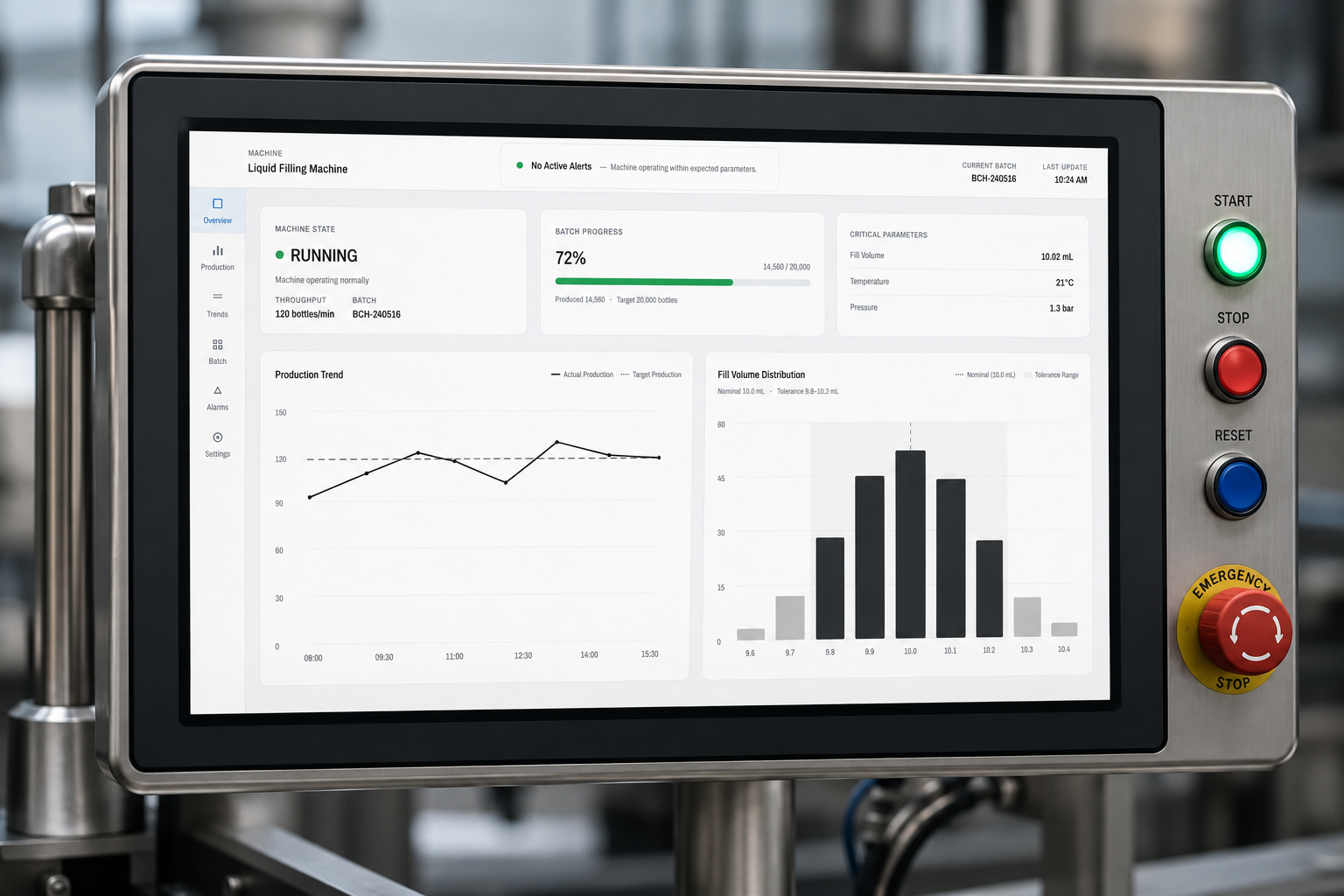
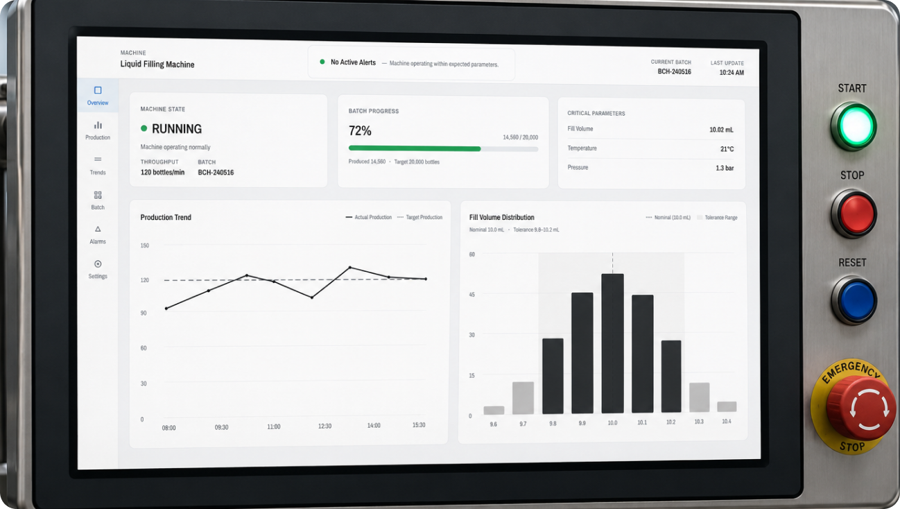
The machine-state cards and chart components, running on the physical HMI panel where operators actually read them.

Documented, not just designed

The framework only works if developers can apply it without a designer in the room. Documentation covered:

Chart selection rules: when to use each chart type and why

Machine state definitions: color, shape, and copy for each of the four states

Color usage: accessible pairings and what each color is allowed to mean

Component instructions: how each reusable component should be implemented

Handed off, not yet validated

By the time I left the company, the framework was fully documented and the components were ready for implementation. The prototype had been prepared for customer validation, but that testing hadn't started yet. This case study reflects the design decisions and the reasoning behind them, not measured outcomes.

I'm including that gap instead of glossing over it. Knowing what wasn't validated matters as much as the framework itself.

Reflection

My first version of this framework looked nothing like what shipped.

I redesigned the chart and machine-state visual language from the ground up: a tighter color system, stronger contrast, a more modern hierarchy. My colleagues reviewed it and liked it. Aesthetically it was stronger, and it passed accessibility checks the old screens never could.

But they raised something I hadn't weighted enough: operators had spent years reading the existing patterns, and a visual language this different would cost them relearning time on a system where speed and certainty matter. That feedback changed the direction of the project. I kept the accessibility and consistency gains, but deliberately brought back the interaction patterns and visual cues operators already knew, instead of replacing them outright.

The lesson wasn't that clarity matters. I already knew that going in. It was learning to balance improvement with familiarity: a better system that no one has to relearn beats a perfect one that does.

INDUSTRIAL UX · NDA, SANITIZED

Industrial HMI

PRODUCT · CO-RESPONSABILITY TOOL

Nidoly

UX RESEARCH · MENTORSHIP APP

BRIDGE

Let’s work together

© 2026

Home

Work

About

Eduarda Freire

Industrial HMI

A industrial UX case study

  • Role

  • Sole UX Designer

  • Industry

  • Industrial / B2B

  • Status

  • NDA — Sanitized

  • Scope

  • 4 Machines · Pharma + Food

Across interfaces in four different machines, two on pharmaceutical machines and two on food production machines, operators were reading the same kind of data through completely different visual rules. Each screen had been built independently: different chart libraries, different color conventions, different visual hierarchies for the same data types. The initiative to fix this came from UX, not from a customer complaint.

As the sole UX designer on the project, I owned the audit, the benchmarking, the visualization framework, the reusable component library, and the documentation that shipped it to development. Color standardization was developed jointly with another UX designer. The result: one set of rules that any of the four interfaces, and any future one, could apply without starting from scratch.

Standardizing Data Visualization Across Industrial HMI Screens.

Creating a unified framework for machine states, charts, and operational data visualization across industrial HMI interfaces.

Fragmented by default

This wasn't only a visual inconsistency problem. There were no shared rules for interpreting machine data, so the same signal could mean something different depending on which screen an operator was looking at. And without a framework, every new screen meant solving the same visualization decisions from scratch, which made the system harder to scale as the product line grew.

Different screens used:

Inconsistent chart types for the same data category

Different color meanings — gray = machine stopped on some, blue on others

Varying visual hierarchies, no standard for data prominence

Inaccessible color choices with insufficient contrast for critical status

Inconsistent interpretation

From audit to framework

01

Existing

Screens

02

Benchmark

Analysis

03

Chart Selection

Rules

04

Machine State

Standards

05

Reusable

Components

06

Documentation

Matching data to the right form

INFORMATION TYPE

RECOMMENDED VISUALIZATION

EXAMPLE

Trends Over Time

Line Chart

Continuous data points

connected by a path

Category Comparison

Bar Chart

Discrete categories with

comparable magnitudes

Machine Status

Status Card

Categorical state with

color-coded meaning

Four states, one visual language

A machine can only ever be in one of four states. Standardizing these states was the most operationally critical part of the project — operators scan multiple screens simultaneously and need to read status at a glance.

Running

MACHINE OPERATING NORMALLY

Visible, confident. The baseline state — highest visual presence on screen.

Stopped

MACHINE OPERATION INTERRUPTED

Neutral, not alarming. Planned stops are part of normal operation.

Message

INFORMATIONAL COMMUNICATION

Low urgency. Informational only — does not require immediate action.

Alert

IMMEDIATE OPERATOR ATTENTION REQUIRED

Highest urgency. Demands attention before any other action is taken.

Rules, not preferences

120px min

G01

Minimum Chart Height

No chart rendered below 120px in height. Below this threshold, grid lines and labels become unreadable at operational viewing distances.

G02

Grid Visibility

Grid lines always visible on charts with continuous data. Opacity 8–12% — present enough to guide reading, invisible enough to not compete with data.

0

G03

Axis Behavior

Y-axis starts at zero unless explicitly justified. Starting mid-range creates visual exaggeration that misleads operators reading at speed.

G04

Label Positioning

Axis labels left-aligned on Y-axis, bottom on X-axis. No rotated labels — if a label needs rotation, the chart type is wrong for the data.

G05

Legend Usage

Legends placed below or beside the chart — never overlaid. Maximum 5 legend items; more categories require a different chart type or grouping.

Color + shape, always

G06

Color Accessibility

All status colors verified against WCAG AA at minimum. No color is used as the sole indicator of meaning — always paired with shape, text, or position. Red is held in reserve for a future critical tier above Alert, so escalation still has somewhere to go.

Built once, applied everywhere

Every chart type and status element was translated into a reusable component with defined properties — minimum height, axis behavior, legend placement, and state indicators baked in. Components were documented in Figma and handed to development as interaction-ready specifications.

CHART

Line Chart

CHART

Bar Chart

RUNNING

ALERT

STATUS

Status Card

INDICATOR

Machine State Indicator

Series A

Series B

Series C

COMPONENT

Legend

100%

75%

50%

25%

W1

W2

W3

W4

COMPONENT

Axis Labels

From Figma to the factory floor

The machine-state cards and chart components, running on the physical HMI panel where operators actually read them.

Documented, not just designed

The framework only works if developers can apply it without a designer in the room. Documentation covered:

Chart selection rules: when to use each chart type and why

Machine state definitions: color, shape, and copy for each of the four states

Color usage: accessible pairings and what each color is allowed to mean

Component instructions: how each reusable component should be implemented

Handed off, not yet validated

By the time I left the company, the framework was fully documented and the components were ready for implementation. The prototype had been prepared for customer validation, but that testing hadn't started yet. This case study reflects the design decisions and the reasoning behind them, not measured outcomes.

I'm including that gap instead of glossing over it. Knowing what wasn't validated matters as much as the framework itself.

Reflection

My first version of this framework looked nothing like what shipped.

I redesigned the chart and machine-state visual language from the ground up: a tighter color system, stronger contrast, a more modern hierarchy. My colleagues reviewed it and liked it. Aesthetically it was stronger, and it passed accessibility checks the old screens never could.

But they raised something I hadn't weighted enough: operators had spent years reading the existing patterns, and a visual language this different would cost them relearning time on a system where speed and certainty matter. That feedback changed the direction of the project. I kept the accessibility and consistency gains, but deliberately brought back the interaction patterns and visual cues operators already knew, instead of replacing them outright.

The lesson wasn't that clarity matters. I already knew that going in. It was learning to balance improvement with familiarity: a better system that no one has to relearn beats a perfect one that does.

INDUSTRIAL UX · NDA, SANITIZED

Industrial HMI

PRODUCT · CO-RESPONSABILITY TOOL

Nidoly

UX RESEARCH · MENTORSHIP APP

BRIDGE

Let’s work together

© 2026

Home

Work

About

Eduarda Freire

Industrial HMI

A industrial UX case study

  • Role

  • Sole UX Designer

  • Industry

  • Industrial / B2B

  • Status

  • NDA — Sanitized

  • Scope

  • 4 Machines · Pharma + Food

Across interfaces in four different machines, two on pharmaceutical machines and two on food production machines, operators were reading the same kind of data through completely different visual rules. Each screen had been built independently: different chart libraries, different color conventions, different visual hierarchies for the same data types. The initiative to fix this came from UX, not from a customer complaint.

As the sole UX designer on the project, I owned the audit, the benchmarking, the visualization framework, the reusable component library, and the documentation that shipped it to development. Color standardization was developed jointly with another UX designer. The result: one set of rules that any of the four interfaces, and any future one, could apply without starting from scratch.

Standardizing Data Visualization Across Industrial HMI Screens.

Creating a unified framework for machine states, charts, and operational data visualization across industrial HMI interfaces.

Fragmented by default

This wasn't only a visual inconsistency problem. There were no shared rules for interpreting machine data, so the same signal could mean something different depending on which screen an operator was looking at. And without a framework, every new screen meant solving the same visualization decisions from scratch, which made the system harder to scale as the product line grew.

Different screens used:

Inconsistent chart types for the same data category

Different color meanings — gray = machine stopped on some, blue on others

Varying visual hierarchies, no standard for data prominence

Inaccessible color choices with insufficient contrast for critical status

Inconsistent interpretation

From audit to framework

01

Existing

Screens

02

Benchmark

Analysis

03

Chart Selection

Rules

04

Machine State

Standards

05

Reusable

Components

06

Documentation

Matching data to the right form

INFORMATION TYPE

RECOMMENDED VISUALIZATION

EXAMPLE

Trends Over Time

Line Chart

Continuous data points

connected by a path

Category Comparison

Bar Chart

Discrete categories with

comparable magnitudes

Machine Status

Status Card

Categorical state with

color-coded meaning

Four states, one visual language

A machine can only ever be in one of four states. Standardizing these states was the most operationally critical part of the project — operators scan multiple screens simultaneously and need to read status at a glance.

Running

MACHINE OPERATING NORMALLY

Visible, confident. The baseline state — highest visual presence on screen.

Stopped

MACHINE OPERATION INTERRUPTED

Neutral, not alarming. Planned stops are part of normal operation.

Message

INFORMATIONAL COMMUNICATION

Low urgency. Informational only — does not require immediate action.

Alert

IMMEDIATE OPERATOR ATTENTION REQUIRED

Highest urgency. Demands attention before any other action is taken.

Rules, not preferences

120px min

G01

Minimum Chart Height

No chart rendered below 120px in height. Below this threshold, grid lines and labels become unreadable at operational viewing distances.

G02

Grid Visibility

Grid lines always visible on charts with continuous data. Opacity 8–12% — present enough to guide reading, invisible enough to not compete with data.

0

G03

Axis Behavior

Y-axis starts at zero unless explicitly justified. Starting mid-range creates visual exaggeration that misleads operators reading at speed.

G04

Label Positioning

Axis labels left-aligned on Y-axis, bottom on X-axis. No rotated labels — if a label needs rotation, the chart type is wrong for the data.

G05

Legend Usage

Legends placed below or beside the chart — never overlaid. Maximum 5 legend items; more categories require a different chart type or grouping.

Color + shape, always

G06

Color Accessibility

All status colors verified against WCAG AA at minimum. No color is used as the sole indicator of meaning — always paired with shape, text, or position. Red is held in reserve for a future critical tier above Alert, so escalation still has somewhere to go.

Built once, applied everywhere

Every chart type and status element was translated into a reusable component with defined properties — minimum height, axis behavior, legend placement, and state indicators baked in. Components were documented in Figma and handed to development as interaction-ready specifications.

CHART

Line Chart

CHART

Bar Chart

RUNNING

ALERT

STATUS

Status Card

INDICATOR

Machine State Indicator

Series A

Series B

Series C

COMPONENT

Legend

100%

75%

50%

25%

W1

W2

W3

W4

COMPONENT

Axis Labels

From Figma to the factory floor

The machine-state cards and chart components, running on the physical HMI panel where operators actually read them.

Documented, not just designed

The framework only works if developers can apply it without a designer in the room. Documentation covered:

Chart selection rules: when to use each chart type and why

Machine state definitions: color, shape, and copy for each of the four states

Color usage: accessible pairings and what each color is allowed to mean

Component instructions: how each reusable component should be implemented

Handed off, not yet validated

By the time I left the company, the framework was fully documented and the components were ready for implementation. The prototype had been prepared for customer validation, but that testing hadn't started yet. This case study reflects the design decisions and the reasoning behind them, not measured outcomes.

I'm including that gap instead of glossing over it. Knowing what wasn't validated matters as much as the framework itself.

Reflection

My first version of this framework looked nothing like what shipped.

I redesigned the chart and machine-state visual language from the ground up: a tighter color system, stronger contrast, a more modern hierarchy. My colleagues reviewed it and liked it. Aesthetically it was stronger, and it passed accessibility checks the old screens never could.

But they raised something I hadn't weighted enough: operators had spent years reading the existing patterns, and a visual language this different would cost them relearning time on a system where speed and certainty matter. That feedback changed the direction of the project. I kept the accessibility and consistency gains, but deliberately brought back the interaction patterns and visual cues operators already knew, instead of replacing them outright.

The lesson wasn't that clarity matters. I already knew that going in. It was learning to balance improvement with familiarity: a better system that no one has to relearn beats a perfect one that does.

INDUSTRIAL UX · NDA, SANITIZED

Industrial HMI

PRODUCT · CO-RESPONSABILITY TOOL

Nidoly

UX RESEARCH · MENTORSHIP APP

BRIDGE

Let’s work together