A UX/UI case study by Eduarda Freire
Role
UX Researcher, UX/UI Designer
Timeline
May – Oct 2024
First-generation students, migrants, and people from low-income families face real barriers to higher education and career growth, not for lack of ability, but because they're navigating complex systems, financial aid, and career paths with no one who's been through it to guide them.
BRIDGE connects them with mentors who've faced similar challenges, plus curated access to universities and financial aid: guidance that used to depend on personal networks, now within anyone's reach.
Designing a user-centred application that opens doors, enables connections, and promotes life-changing opportunities.
Research
Research combined user interviews, competitor analysis, and affinity mapping across 5 participants: migrants and first-generation students spanning academic disciplines and career stages, from master's students to working professionals.
Three insights stood out:
Users wanted mentors who shared their lived experience — not just professional expertise — to make guidance feel relevant and trustworthy.
Information about universities, financial aid, and community resources was hard to find, especially for migrants and people in remote areas.
Beyond information, users wanted to feel part of a supportive community and included in the academic environment — not just pointed toward resources.
Design Strategy
These three insights shaped every major decision: lived experience over credentials, low visibility into university and aid options, and an interface that felt familiar and worked on a limited connection.
The response was a single discovery model, swipeable cards, applied across mentors, universities, and financial aid, with lived experience surfaced as a key signal wherever possible.
Design Decisions
01 — Why swipe matching
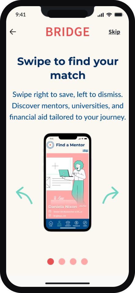
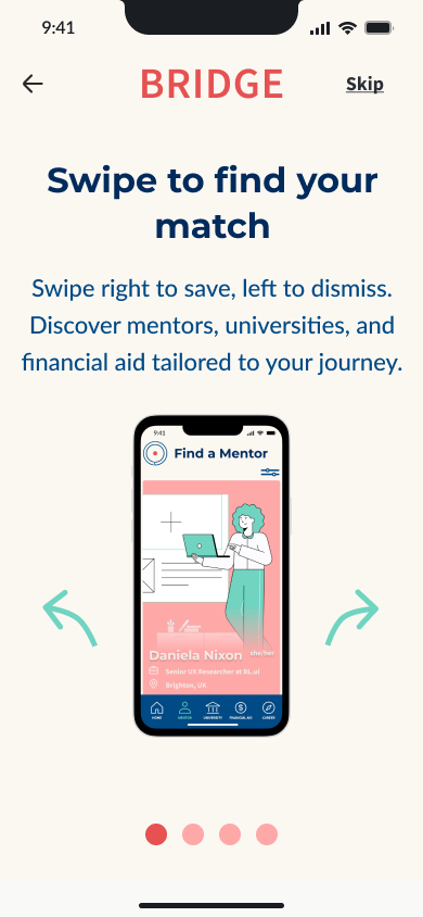
Mentors, universities, and financial aid appear as swipeable cards: right to save, left to dismiss, borrowing the pattern from dating apps.
Participants already navigated unfamiliar systems: financial aid, university admin, academic culture. A new interaction pattern would add friction, so swipe matching uses a gesture users already know, leaving attention for evaluating mentors and opportunities, not learning the app.
Trade-off: swiping suits quick browsing, but choosing a mentor is higher-stakes than a dating-app match. Each card links to a full profile: swipe handles discovery, the profile handles the decision.
03 — Why university discovery
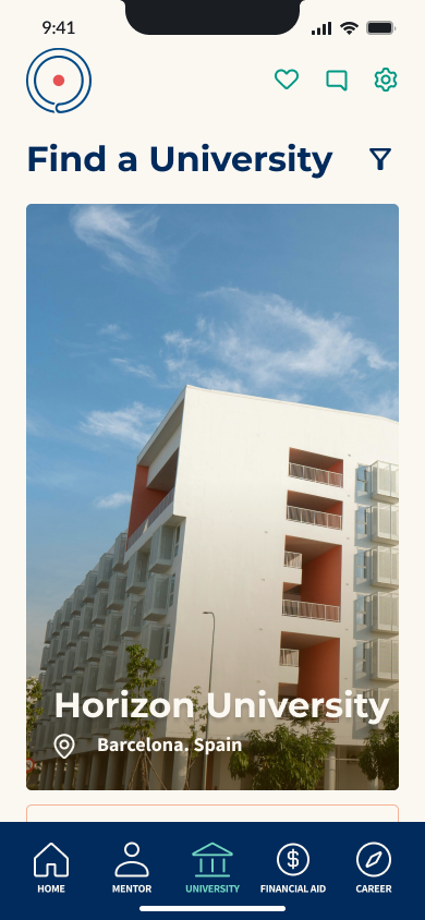
Several participants had little visibility into which universities existed, what they offered, or whether they'd welcome migrants and first-generation students. Someone in a rural area, far from where universities concentrate, finds that research even harder to start.
University discovery turns that open search into curated browsing, surfacing what participants said was hardest to find alone: location, programs, student support.
Trade-off: discovery surfaces options users might not find alone, but can't verify which institutions are genuinely inclusive. That needs input from mentors or alumni who've studied there, not yet part of the platform.
04 — Why financial aid discovery
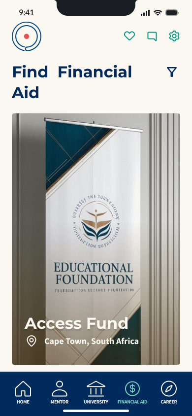
Financial aid was one of the clearest pain points in the research: participants knew scholarships and funding existed but not where to look, what they qualified for, or how the process worked. For low-income and first-generation students, that uncertainty often decided whether higher education felt possible.
Financial aid discovery applies the same browsing pattern as mentors and universities, surfacing opportunities by location and relevance, so users see what's available without researching every aid office.
Trade-off: financial aid comes with eligibility criteria and deadlines a browsing card can't capture. Cards build awareness, not a substitute for reading the actual requirements.
Key trade-offs
Discovery vs. decision-making — swipe handles discovery, not the final decision, across mentors, universities, and financial aid. Every card routes to a fuller profile before a user commits.
Surfacing vs. verifying — the app surfaces opportunities users might not find alone, but can't verify inclusivity, eligibility, or outcomes, since that depends on input it doesn't collect today (mentor/alumni feedback, application results).
Accessibility vs. feature richness — many participants used limited or unreliable connections, often rural. That ruled out heavier features like video for lightweight, text- and image-based screens that work on low bandwidth.
02 — Why mentor matching by lived experience
The strongest, most consistent finding across interviews: participants wanted mentors who shared their lived experience, migration history, cultural background, identity, not just professional expertise.
"I find it important that my mentor has a similar life reality to mine."
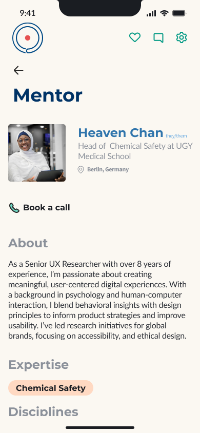
Participants described well-intentioned mentors without that shared context as unable to fully understand their situation. So mentor profiles surface background and identity alongside professional credentials, giving mentees context to judge whether a mentor's advice fits their reality, not just their resume.
Trade-off: matching on identity risks reducing mentors to a single trait. Profiles balance this by pairing background with full bios and expertise, so identity is one signal among several, not the whole picture.
Core User Journey
Mentor discovery flow
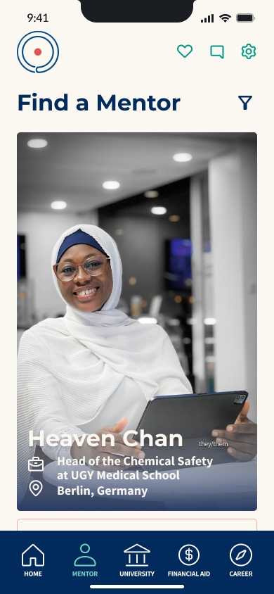
From the dashboard, users land on Find a Mentor, where swiping right saves and left dismisses. Tapping a card opens a full profile: background, expertise, a way to start a conversation. Saved mentors collect in "My Favorites," a shortlist to return to when ready.
This is the app's core loop, discover, evaluate, save, connect, and the flow most heavily tested in usability sessions.
Accessibility
Contrast that meets WCAG AA/AAA — the palette uses modern, optimistic tones, but every text and UI combination was checked against WCAG standards, so readability doesn't depend on perfect vision or screen quality.
Flat, simple visuals over decoration — icons and illustrations use flat design over complex graphics, reducing visual noise that makes screens harder to scan for cognitive or visual differences.
Lightweight by default — text- and image-based screens, not video-heavy interactions, keep the app usable on older devices and unreliable connections, accessibility often overlooked in mentoring platforms.
Representation gap (honest reflection) — the illustration set skews toward able-bodied, white figures, not reflecting the community the app serves. Flagged as a priority fix, not hidden.
Final Solution
Six curated screens from the final prototype, covering the core flows: onboarding, mentor discovery, mentor profiles, university and financial aid discovery, and the dashboard tying it together.
Onboarding
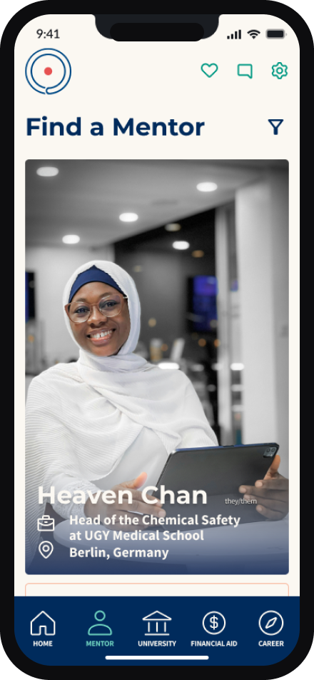
Find a Mentor
Mentor profile
Find a University
Find Financial Aid
Dashboard
Usability Testing
Findings
Six participants from the target audience, first-generation students, low-income individuals, migrants, tested the prototype in moderated remote sessions: registering, finding a mentor, sending a message, thinking aloud throughout. A Rainbow Spreadsheet separated one-off confusion from recurring issues.
The most common pain points clustered around mentor matching: participants weren't always sure what swiping right vs. left did, or how to get back to a profile after dismissing it.
Design iterations
Before
After (NEW)
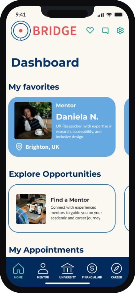
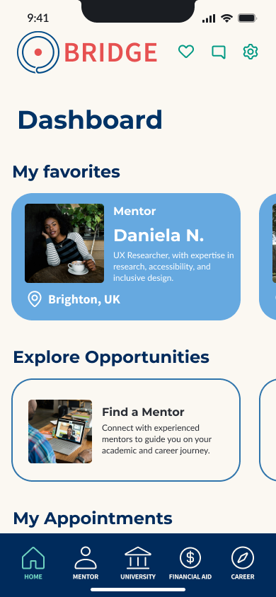
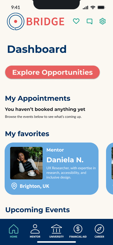
One clear change came from the dashboard. Participants who'd swiped right on a mentor weren't sure where that match went: "My Favorites" sat buried below an empty "My Appointments" section, under a vague "Explore Opportunities" button.
The redesign moves saved mentors to the top, answering "where did my match go?" immediately, and swaps the generic CTA for a specific entry point describing what it does.
This reflects the broader pattern from testing: vague labels and buried content caused more confusion than the swipe gesture itself.
Reflection
Lessons learned
Shared identity is an asset, and a bias risk. Being part of the community I was designing for made interviews feel natural and surfaced honest insights. It also meant checking my own experience wasn't standing in for the data, staying curious rather than assuming I knew the answer.
Diverse user groups need to stay diverse. Migrants, first-generation students, and low-income individuals overlap, but one generic profile would oversimplify very different needs (rural connectivity vs. urban integration). Keeping them distinct shaped decisions like financial aid and university discovery.
Real-world constraints come first. Designing for unreliable connections meant ruling out heavier interaction patterns early. Accessibility wasn't an add-on; it was a constraint shaping the experience from the start.
Future improvements
Diverse illustration set — replace the current illustrations, which skew toward able-bodied, white figures, with one reflecting the community the app serves.
Verification layer for discovery — let mentors and alumni feedback on universities and aid programs close the gap between "surfaced" and "verified."
Deeper accessibility testing — extend beyond contrast and flat visuals to screen reader and assistive-tech testing with users who rely on them.